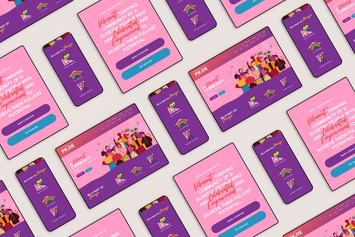
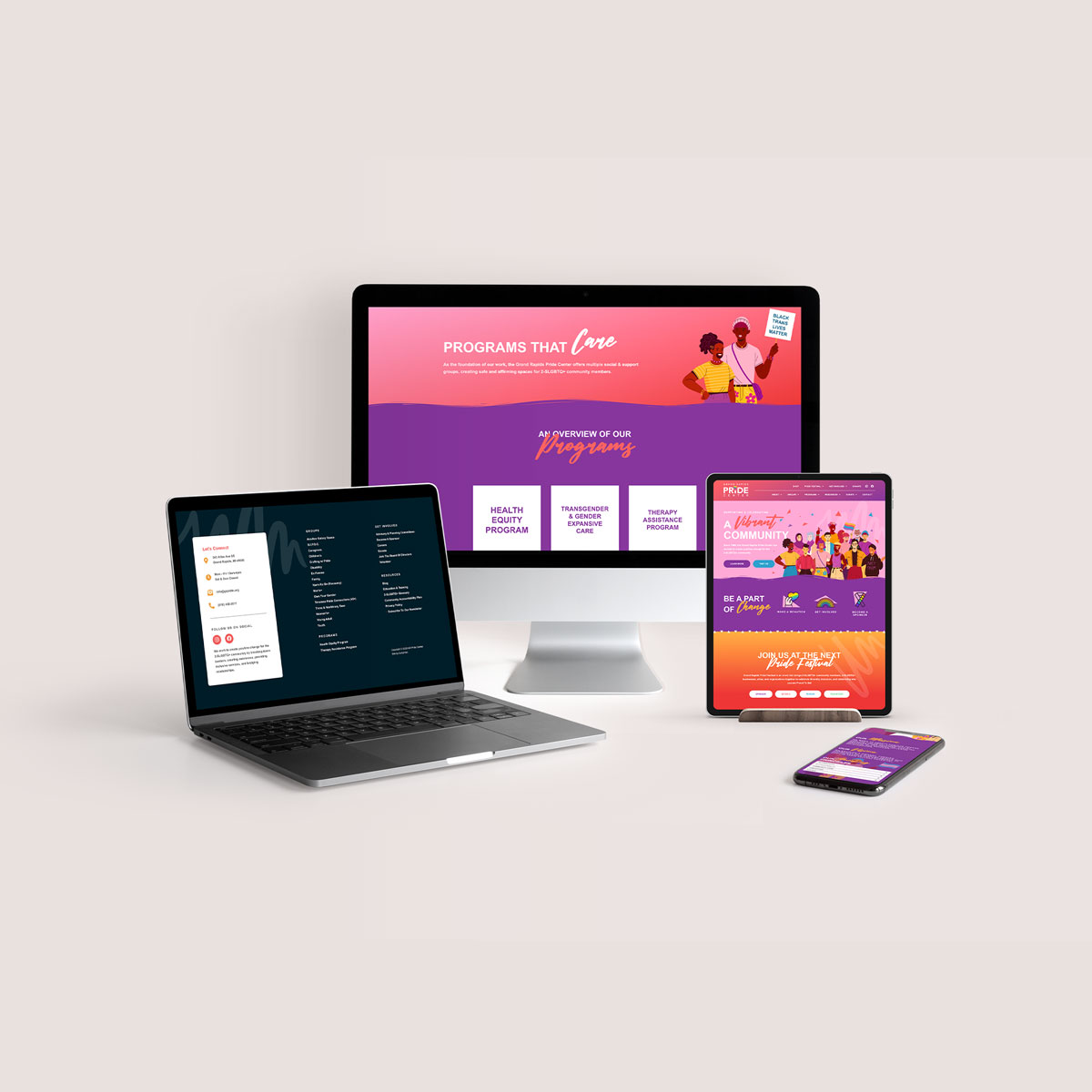
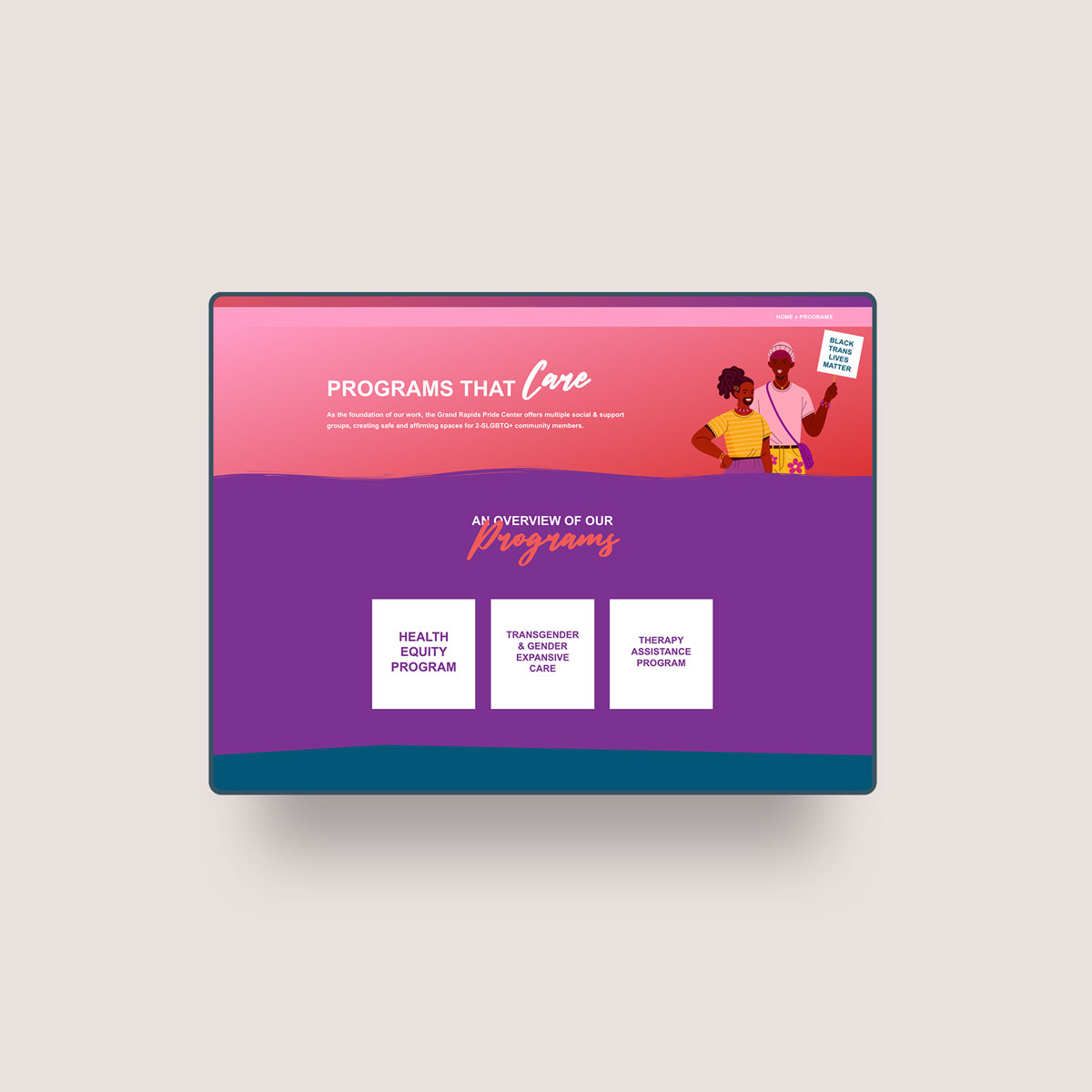
Grand Rapids Pride Center
WordPress Development
Completed 2023

Project Overview
The Grand Rapids Pride Center required a large-scale website that could function as a true community hub — not just an informational brochure. The site needed to support events, education, and inclusive language while remaining accessible, navigable, and sustainable long-term.
I was brought in after an initial homepage design was provided by a design partner. My role focused on accessibility strategy, development, and system-level problem solving across a site with many pages, contributors, and user needs.
The Challenge
This project presented multiple layers of complexity:
-
A large, content-heavy site with many interconnected pages
-
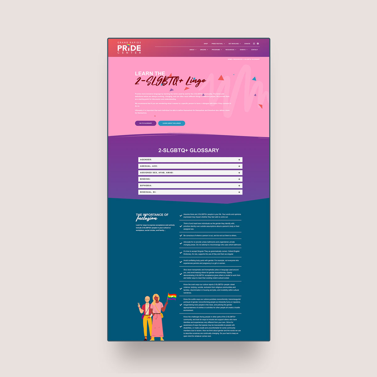
A community glossary, including terminology and pronouns, that needed to be respectful, clear, and easy to navigate
-
A requirement for the site to function as a central events hub for the community
-
A bold, non-neutral color palette that had to remain intact — and had to be accessible
-
Advanced navigation needs to prevent users from getting lost
The most significant challenge was accessibility. Color is deeply tied to identity and visibility for LGBTQ+ organizations, and the goal was never to “tone it down” for the sake of compliance.
Outcome
The finished website supports the Grand Rapids Pride Center as both an informational resource and an active community space. It demonstrates that accessibility and strong visual identity are not opposing forces — they are complementary when handled with care and technical understanding.
This project reflects my belief that inclusive design is not about restriction. It’s about knowing the standards well enough to design boldly within them — and ensuring more people can participate, engage, and belong.
Strategy & Approach
Accessibility-First Color Strategy
A common misconception is that accessibility requires muted or grayscale design. In reality, accessibility is about contrast, hierarchy, and intent — not the absence of color.
For this project, I worked directly with the existing palette and adjusted pairings, usage rules, and contrast relationships to meet Web Content Accessibility Guidelines (WCAG) standards while preserving the vibrancy and emotional impact of the brand.
This approach allowed the Pride Center to keep the colors that matter to their community — without excluding users with visual impairments.
Information Architecture & Navigation
Because of the site’s size and scope, navigation was critical.
The solution included:
-
An advanced navigation system designed to surface key resources quickly
-
Breadcrumbs to support orientation and reduce cognitive load
-
Clear page hierarchies to help users understand where they are and where to go next
The goal was to make the site feel welcoming rather than overwhelming — even for first-time visitors.
Community-Centered Features
Community-Centered Features
Events & Programming
To support the Pride Center’s role as a community hub, the site integrates The Events Calendar Plus, paired with Google Calendar. This allows:
-
Centralized event management
-
Easy updates for staff
-
Familiar calendar-based interaction for users
Events are displayed clearly across the site, reinforcing the organization’s ongoing activity and community presence.
Inclusive Language & Glossary
The site includes a dedicated term glossary, with space for pronouns and evolving language. This section was designed with flexibility in mind, acknowledging that inclusive language grows and changes over time.
Clarity, respect, and ease of reading guided every design and structural decision here.
Typography & Visual Systems
Community-Centered Features
Events & Programming
The site uses custom-installed typography, selected to balance warmth, clarity, and readability across devices. Typography was treated as a functional system — not decoration — supporting long-form reading, accessibility, and hierarchy throughout the site.


